
Using AI to Supercharge Your Power BI Desktop Workflows
Explore how AI capabilities in Power BI Desktop can transform your data analysis — from smart narratives to automated insights and natural language queries.
Power BI Desktop has evolved far beyond a simple drag-and-drop reporting tool. With Microsoft’s steady investment in AI, it now offers features that genuinely change how analysts interact with data. In this post, I’ll walk through the AI-powered capabilities that I find most useful day-to-day.
Why AI in Power BI Matters
Data analysis has traditionally been a manual, iterative process — write a query, build a visual, interpret the results, repeat. AI shortcuts that loop by surfacing patterns, generating narratives, and answering questions in plain English. The goal isn’t to replace the analyst; it’s to eliminate the tedious parts so you can focus on the interesting questions.
Key AI Features in Power BI Desktop
1. Q&A Visual (Natural Language Queries)
The Q&A visual lets you type questions like “total sales by region last quarter” and Power BI generates the appropriate chart. Under the hood it maps your natural language to the data model.
Tips for getting the most out of Q&A:
- Define synonyms in your data model — if your column is called
Rev_Total, teach Q&A that “revenue” and “sales” mean the same thing - Keep your table and column names descriptive; the AI relies heavily on them
- Use the Q&A setup tool to review and train suggested questions
# Example: Preparing clean column names before importing to Power BI
import pandas as pd
df = pd.read_csv("sales_data.csv")\ df.columns = [\ "Order Date", "Region", "Product Category",\ "Units Sold", "Revenue", "Profit"\ ]\ df.to_csv("sales_data_clean.csv", index=False)
2. Smart Narratives
Smart Narratives automatically generate text summaries of your visuals. Drop one onto your report page and it produces a dynamic paragraph that updates as filters change.
This is particularly useful for:
- Executive dashboards where stakeholders want a text summary alongside the charts
- Automated reports distributed via email — the narrative gives context without requiring the reader to interpret the visual
- Accessibility — providing a text description of chart trends
You can customize the generated text, insert dynamic values, and control which measures it references.
3. Key Influencers Visual
The Key Influencers visual uses ML under the hood to answer “what factors influence this metric?” For example, if you’re analyzing customer churn, it will rank the variables that most strongly correlate with churn — say, contract type, tenure, or support ticket count.
This is essentially a lightweight feature importance analysis without needing to export data to Python or R. For quick exploratory work, it saves a lot of time.
4. Anomaly Detection
Time series visuals in Power BI can now flag anomalies — data points that deviate significantly from the expected pattern. When you enable this, Power BI runs a model in the background and highlights outlier points directly on the line chart.
Clicking on an anomaly shows a breakdown of possible explanations, ranked by strength. This is useful for:
- Monitoring KPIs for unexpected spikes or drops
- Identifying data quality issues early
- Flagging events that warrant deeper investigation
5. Decomposition Tree
The Decomposition Tree visual lets you break down a measure across multiple dimensions interactively. The AI-driven option (“High value” / “Low value”) automatically picks the next best split — essentially guiding you toward the most significant segments.
This is great for root cause analysis. Instead of manually slicing data across every combination of dimensions, the AI highlights where the biggest effects are.
Integrating Python and R for Custom AI
When the built-in AI visuals aren’t enough, Power BI Desktop supports Python and R scripts directly. You can:
- Run a Python script as a data source or transformation step in Power Query
- Use a Python visual to render custom plots (matplotlib, seaborn, plotly)
- Build and score ML models inside your report
# Example: Simple anomaly detection with Python in Power BI
import pandas as pd
import numpy as np
'dataset' is automatically provided by Power BI
df = dataset.copy()\ mean_val = df["Revenue"].mean()\ std_val = df["Revenue"].std()
df["Z_Score"] = (df["Revenue"] - mean_val) / std_val\ df["Is_Anomaly"] = np.abs(df["Z_Score"]) > 2
This is powerful because it keeps everything within the Power BI ecosystem — no need to export CSVs, run notebooks separately, and re-import. The feedback loop stays tight.
Copilot in Power BI (Preview)
Microsoft has begun rolling out Copilot integration in Power BI. With Copilot, you can:
- Describe a report page in natural language and have it generate visuals
- Ask Copilot to create DAX measures
- Summarize an entire report in text
This is still evolving, but it represents the direction things are heading: AI as a co-pilot (pun intended) that accelerates the build-test-iterate cycle.
Getting the Most Out of These Features
- Start with clean data models. AI features work best when your tables, columns, and relationships are well-structured and clearly named.
- Use Q&A training. Spend 10 minutes setting up synonyms and suggested questions — it dramatically improves the natural language experience.
- Combine built-in AI with custom scripts. Use Key Influencers for quick exploration, then validate with a proper Python model when the stakes are high.
- Don’t over-rely on auto-generated insights. They’re a starting point for investigation, not a conclusion. Always sanity-check what the AI surfaces.
Wrapping Up
None of these features replace the work of actually understanding your data — Q&A, Smart Narratives, Key Influencers, and the rest are shortcuts through the mechanical parts of analysis, not substitutes for judgment. Used that way, they make a real difference: less time on the repetitive middle of the analysis loop, more time on the questions that actually matter.
Start simple with the built-in visuals, and reach for Python or Copilot only when the question genuinely demands it.
Related Posts
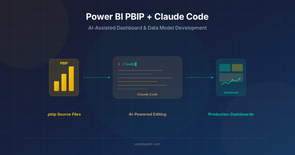
How PBIP makes Power BI projects easier to diff, review, and edit with tools like Claude Code, with a practical look at where the workflow helps and where it still needs care.
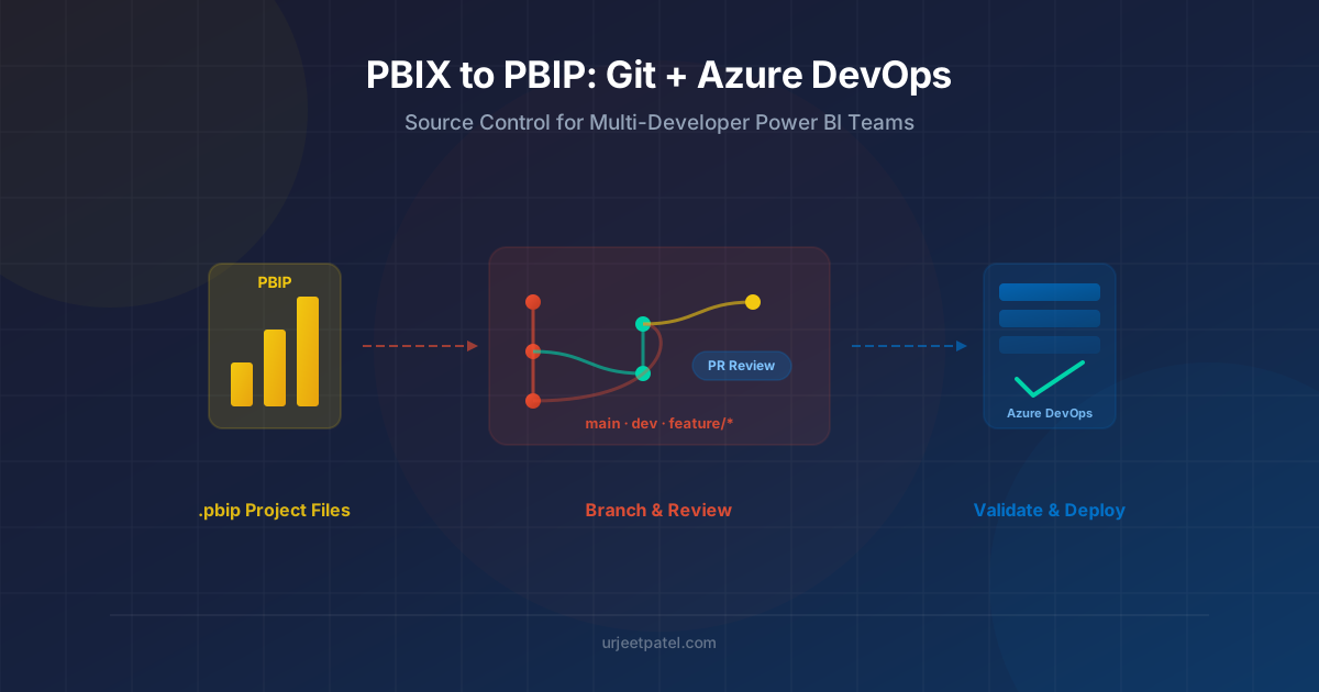
A practical migration guide for experienced Power BI developers moving from PBIX to PBIP, with a real Git branching model and an Azure DevOps setup that supports multiple developers working on the same reports and semantic models.